Let's say you're working on a page that has two main components - Element A and Element B.
Suppose you had to implement a responsive layout with the following requirements:
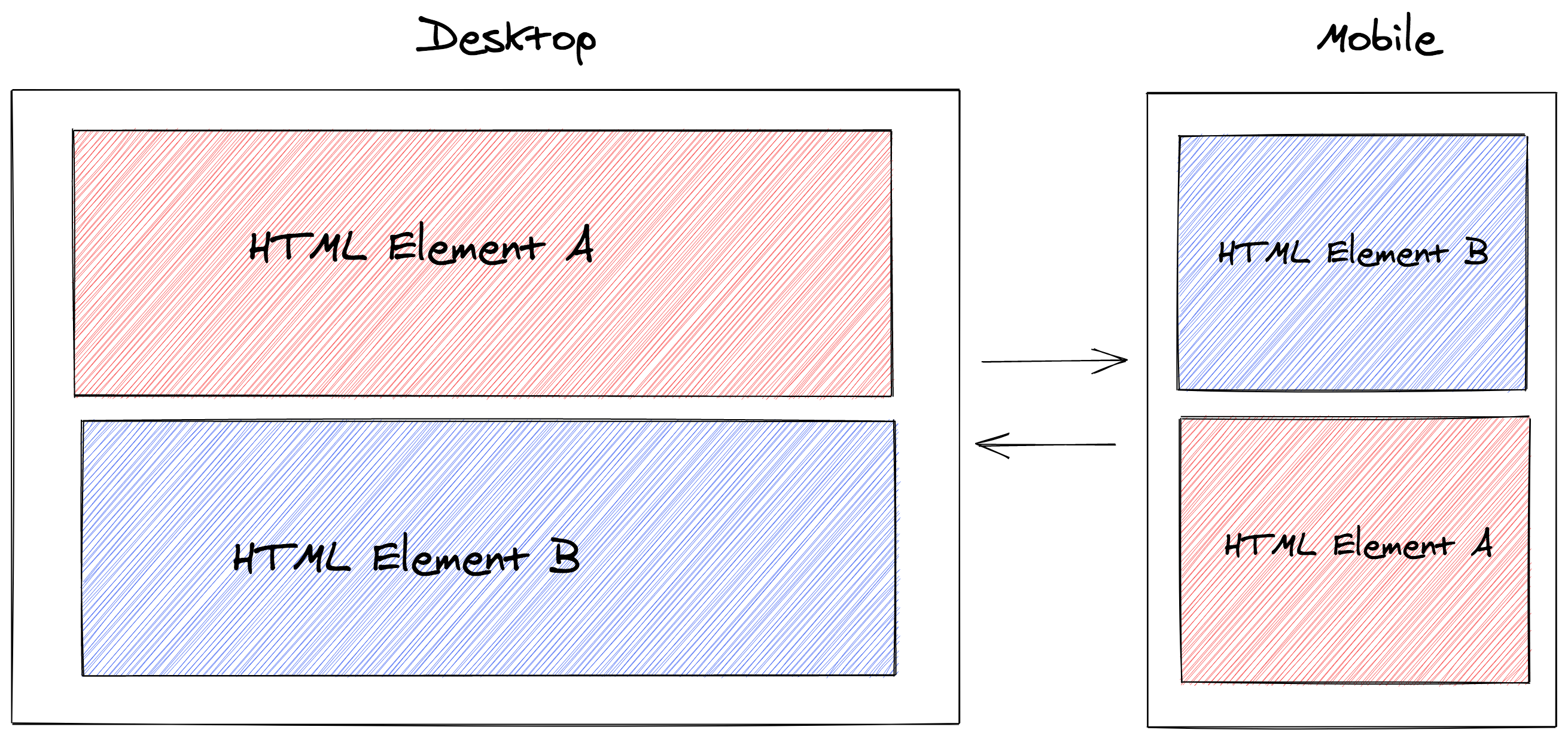
- Desktop: Element A should be positioned on top of Element B
- Mobile: Element B should be positioned on top of Element A
In this tutorial, we'll look at two different approaches to solve these requirements.
Here's what we'll be setting to achieve:
Before we begin
It's important to clarify some pre-conditions and set the right expectations as to what the end result will exactly be.
We assume that both elements are siblings in the DOM - i.e., both are direct descendants of the same parent element:
<section class="parent">
  <div id="element-a" class="element">
    <h2>HTML Element A</h2>
  </div>
  <div id="element-b" class="element">
    <h2>HTML Element B</h2>
  </div>
</section>
We'll look at two different solutions. Both accomplish the requirements visually. However, there are some nuances that can make you decide for one or the other.
Here are some quick remarks for each solution, so you can jump right away to the one that better fits your use case.
Solution 1:
- The parent element has to be a flex container
- Achieved using CSS
- Does not actually change the DOM order of the elements
- Less implementation steps
- Breaks keyboard navigation
Solution 2:
- Achieved using JavaScript
- Changes the DOM order of the elements
- More implementation steps
- Does not break keyboard navigation
Solution 1: flex-direction
As you may have guessed from the title, we'll be using flexbox. The parent element has to be a flex container. This is how we make it one:
.parent {
  display: flex;
  flex-direction: column;
}
We've also used flex-direction to set the main axis and define how child
elements are placed inside the parent container.
By default, flex items are displayed in the same order as they appear in the document.
Now, for the mobile layout we want to reverse the order in which the elements
are displayed. The value column-reverse does precisely this. Let's go ahead
and add a media query to reverse the flex-direction whenever the display area
has a maximum width of 767 pixels:
@media (max-width: 767px) {
  .parent {
    flex-direction: column-reverse;
  }
}
And we're done, that's all we need!
It is important to bear in mind that this solution creates a disconnect between the visual presentation and the DOM order.
"This will adversely affect users experiencing low vision navigating with the aid of assistive technology such as a screen reader. If the visual (CSS) order is important, then screen reader users will not have access to the correct reading order." - MDN web docs
If you have more than two child elements and would like to have more control over their individual display order, checkout the order property.
Solution 2: DOM manipulation
We'll be using JavaScript - via HTML DOM API - to access the document and its elements.
The strategy is to select the element that should be on top - based on the maximum width of the display area, and insert it as the first child of the parent element.
First, let's create a variable to represent our media query:
const mobile = "(max-width: 767px)";
The Window interface provides the method matchMedia() - which returns a
media query list, matching a specified media query string.
We can then check whether our variable mobile matches with the current state
of the document.
So let’s define a function that conditionally sets Element A or Element B as first child of the parent element:
function setFirstChild() {
  const matched = window.matchMedia(mobile).matches;

  const topElement = matched
    ? document.getElementById("element-b")
    : document.getElementById("element-a");

  const parent = topElement.parentNode;
  parent.insertBefore(topElement, parent.firstChild);
}
Notice that there was no need to explicitly remove it from the DOM, store it in a temporary variable, and append it again.
Since it already exists in the document, insertBefore() moves it from its
current position to the new position.
Now, we attach the function we've just created to the load event, so it runs when the document is loaded:
window.onload = setFirstChild;
Finally, we need to watch for media query changes, so that if the user resizes the browser the order updates accordingly:
window.matchMedia(mobile).addEventListener("change", setFirstChild);
You can now test that everything is working as expected by reloading and resizing the browser.
Wrapping up
We've seen two ways to dynamically change the order of HTML elements based on the display width. Neither is necessarily better.
Solution 1 is arguably more practical. However, it breaks keyboard navigation.
Solution 2 manipulates the DOM, which is operationally more intensive than just using media queries.
You can reference the code I used to create this tutorial, which includes examples for both solutions.
Acknowledgements
Thanks to Hemlock for mentioning a way to move a DOM element without having to remove and append it again to the DOM.